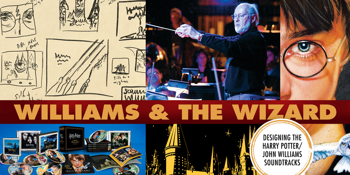
Williams and the Wizard
Looking back at the designs for Harry Potter - The John Williams Soundtrack Collection
CD Box Set for La-La Land Records and Warner Bros., 2018
As fans celebrate 20 years since the first Harry Potter film, I thought I'd take a #ReturntoHogwarts myself and look back at my designs (including unused ideas) for a boxed set of soundtracks for John Williams’s music from the first three movies. I began sketching the ideas below for a slipcase box cover about two years before it was released.
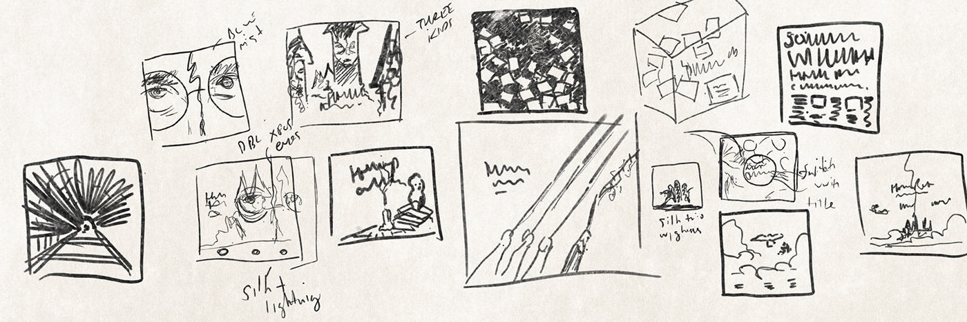
Putting pen to paper helps me work through problems quickly, and weigh an idea’s potential. The sketch of Ron, Harry and Hermione's three wands casting spells alongside a conductor’s hand and baton (above middle) was an early favorite of mine, and something I would have created digitally using original elements and photography. I also sketched some ideas (shown in the digital mockups below) for which an illustrator would have had to come in to provide finished, painted art.


However, word came down that any original art for the slipcase would only slow down approvals, and I should try to stick to cleared photography. A few of my early thumbnails -- the flurry of letters from Hogwarts and the Daily Prophet fish wrap (top right in the sketch samples)--pushed those bounds a bit, but remained in contention till the end. Before we look at those more closely, a short note on the overall art direction....
Beginning with The Prisoner of Azkaban in 2004, the Harry Potter films began to settle into a more mature brand of world-building, as reflected in the production design and props. The magical newspaper the Daily Prophet was treated to bolder, more graphic headlines. The Hogwarts school books evoked ornately-designed old hardcovers (see below), with geometric patterns and borders worn with age. Even flyers posted on school walls had the feel of roughly-printed broadsides from the late 19th century.

Vintage books and turn-of-the-century posters (above) were the inspiration for film props in the later sequels. The new look carried through to various tie-in books and merchandise the licensing department continues to produce today (samples below).

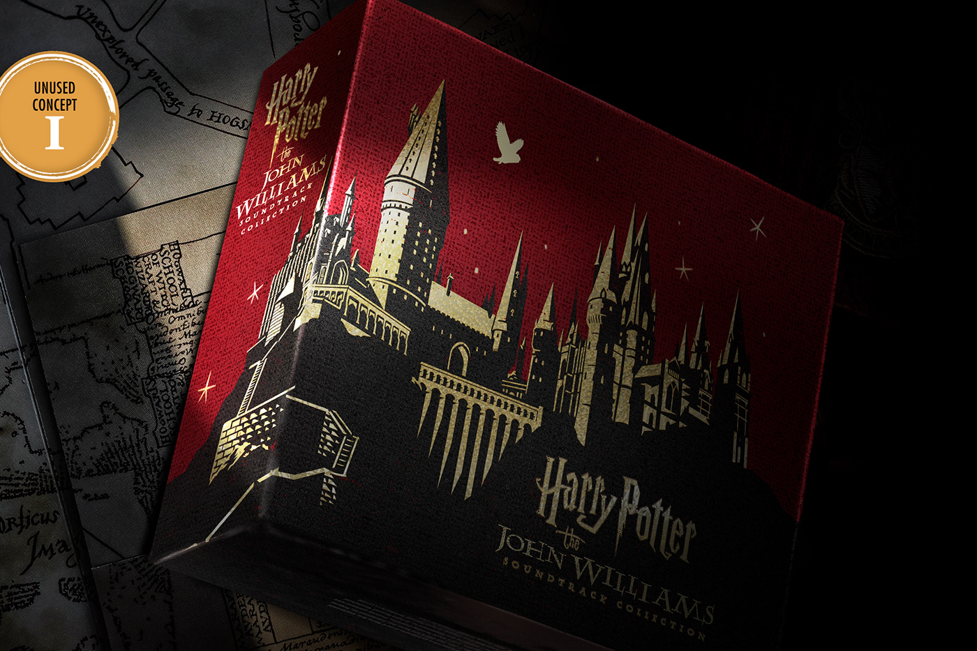
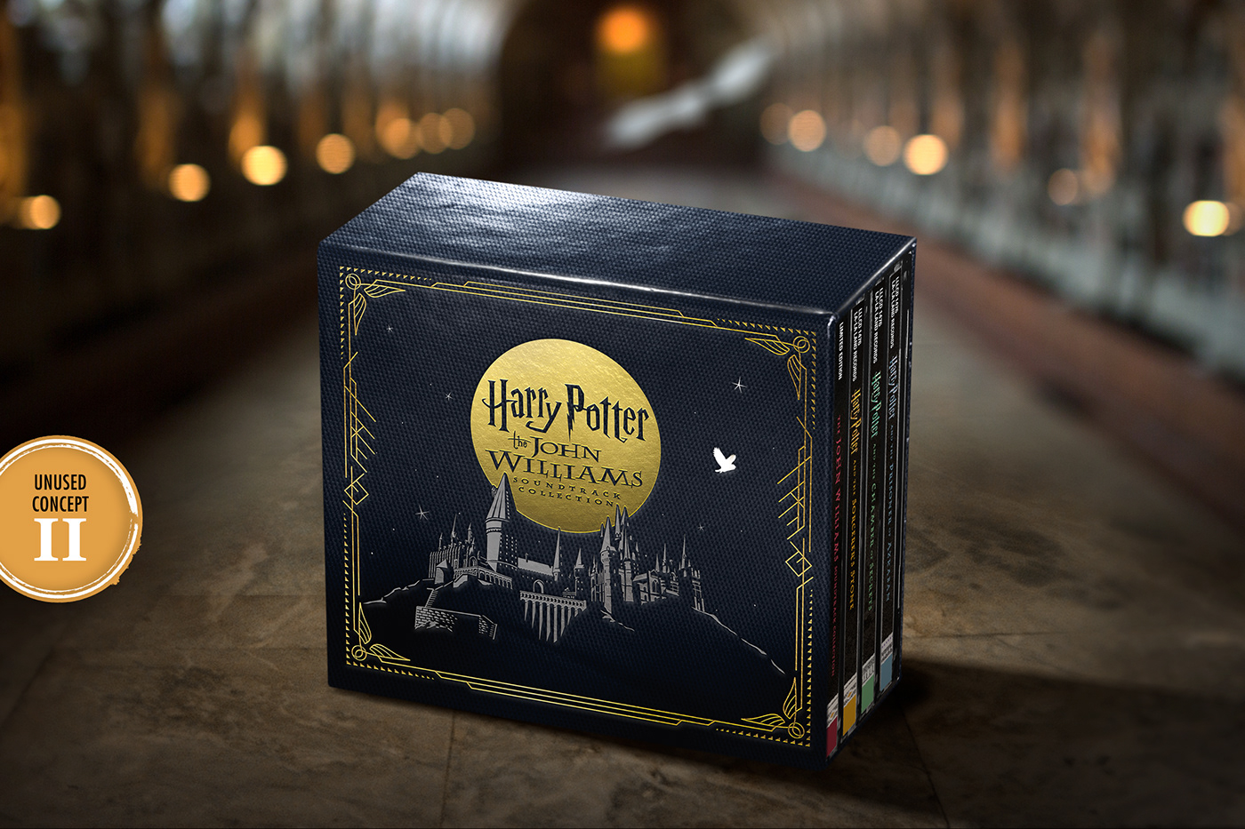
The following unused ideas for the slipcase box were designed with that same, slightly punk reworking of vintage elements. Knowing an image of Harry's school would be needed for at least two of the concepts in the next round of digital mockups, I needed to decide what that would look like.

Plenty of screenshots of Hogwarts were provided by the licensing folks, but the school was either cut off awkwardly, or had been rendered with too much gloss and detail for the simplified look found on all those vintage book covers I'd dug up in my research. So I grabbed additional online photos of the model on display at the London Studio Tour and Orlando theme park for reference in drawing my own version using Adobe Illustrator (see progression below).


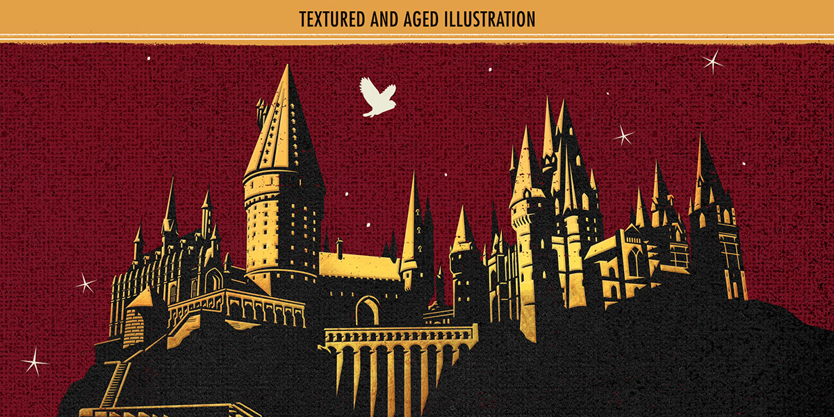
The illustration was then suitably aged with simulated gold foil (for proofing purposes) and rendered against a linen texture.
In the end, neither of these first two concepts (I and II below) was selected, but the Hogwarts illustration used on both was repurposed and re-colored as a backdrop for the seven discs in the set.
Concept III (below) featured a flurry of Hogwarts invitations, but the design didn't have much wow factor. I like the general idea, but I have to wonder if the scale of the box is working against it. The size of a CD set made the detail in the letters an afterthought. Perhaps if this had had a simultaneous release on vinyl it would have clicked.

The last of these unused box ideas–concept IV–was designed to appear as if it had been wrapped in old issues of the Daily Prophet (sample reference below). The “J” in Mr. Williams’s name would have been set in gold foil to mirror the treatment of the “P” in the Prophet's masthead.

I still have a soft spot for Concept IV (below). However, if I've learned anything working as a freelance designer, it's that certain concepts are too difficult to push all the way up that approvals hill without universal support from everyone involved, and this idea didn't have it.
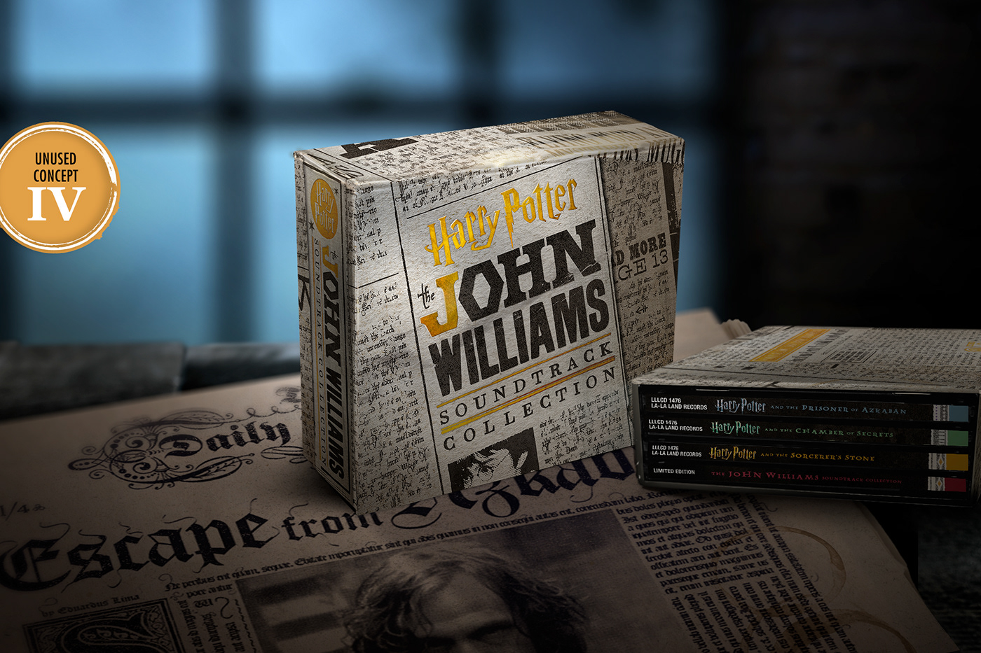
The headlines for the various Daily Prophet articles had to be carefully arranged so as to make them unreadable and not a distraction, and the below image of Harry (below) was created to be recognizable but not a point of focus as it crosses the fold.

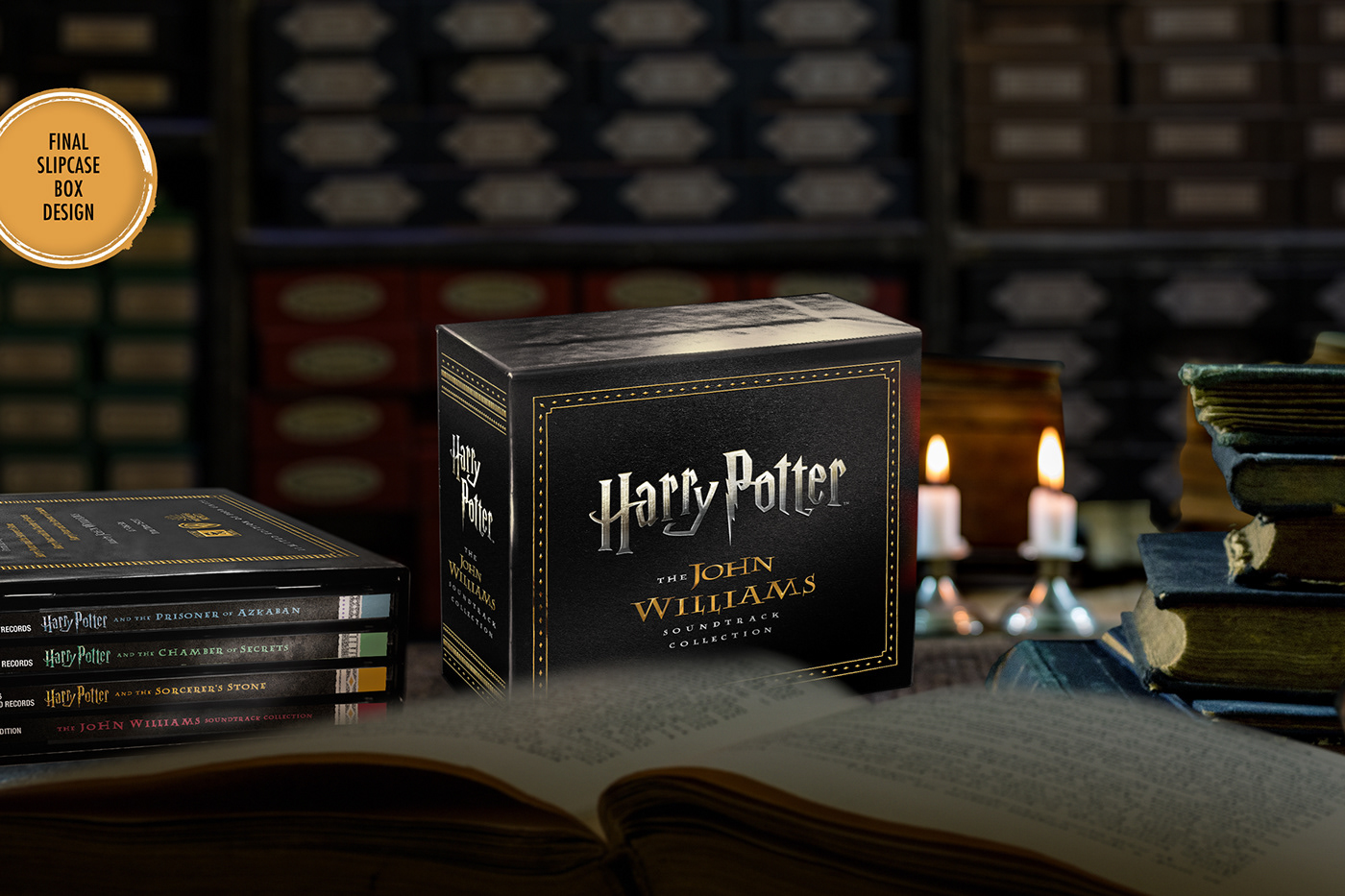
The final, approved slipcase shown below was clean and understated, printed with both gold and silver foil.
With the outer packaging settled, let's talk interiors. For boxed soundtrack sets or scores in an ongoing series, I favor a strong sense of consistency in layout design, but insist on room for some individuality. The borders, frames, and other recurring visual motifs shown below were developed as a set to give a unique but still uniform look to each of the four booklets in the set.


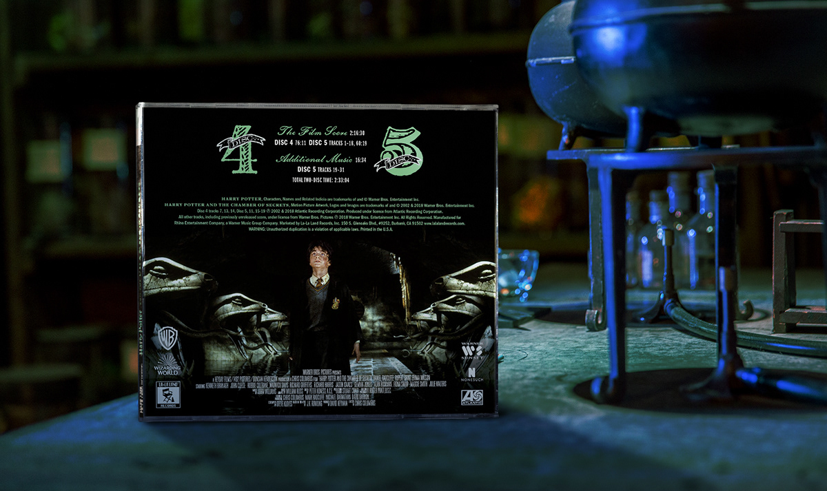
Color coding helped further separate the three films — Gryffindor red and gold for the first, Slytherin green for the second and a ghostly blue for the third – seen prominently in the spine designs (below) and the individual disc backgrounds.


Along with the custom frames and borders developed for the set, the booklet backgrounds were given slight tints of cream, green, and blue to mirror the set's color-coding system.


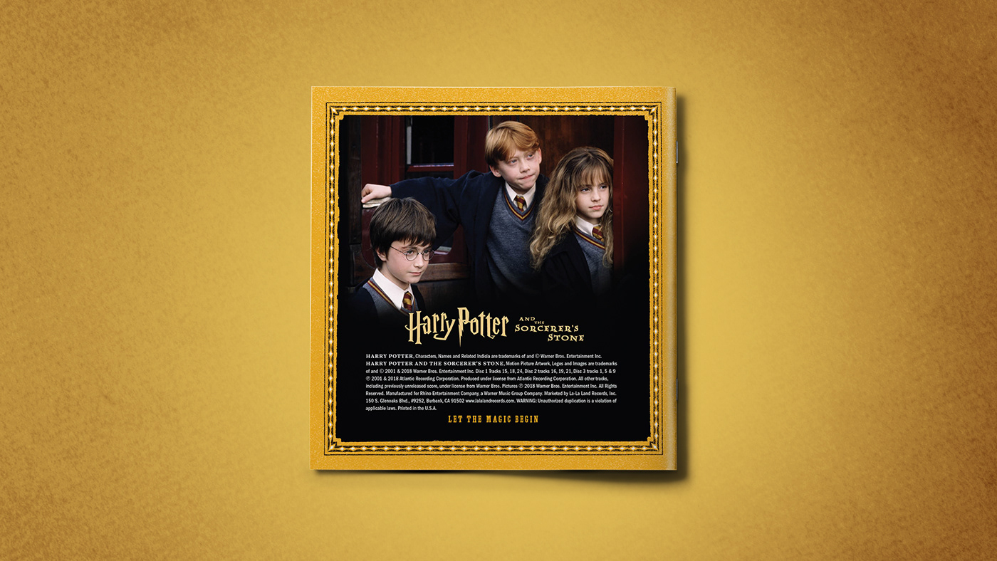
Similar but unique borders were used on each of the booklet covers, to tie them together as a set. Due to the width of the cover on Sorcerer's double-wide jewel case, separate traditionally square covers for that first film were released digitally - in both the US and UK titles (below). For the Prisoner of Azkaban cover, like the first two films, I'd hoped to use key art different than what appeared on the original 2004 soundtrack edition. However this rights for this art (also seen below) could not be cleared.


Above: For iTunes users, the wider tray cover for the first film was also released online in a square format, and with both the US and UK titles.


On the subject of disc artwork in multi-disc sets, photo selection is key. The donut hole in the middle of a CD label can be a tricky layout, and with limitations on what photography is available, I occasionally end up short a photo for an otherwise solid theme. This happened with La-La Land's Superman: The Movie album where there simply wasn’t a WB-approved, solo portrait of Margo Kidder’s Lois Lane to use.
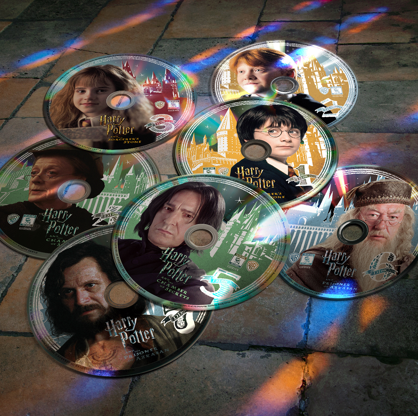
With so many characters in the Potter films, I knew we wouldn't have room for all. Our most noticeable omission was Richard Harris. We couldn't justify two Dumbledores in a set of seven discs. While Harris's Dumbledore is in two of the three films in this set and Michael Gambon’s just one, the latter actor's tenure was longer, and I feel he gave a more spirited and enduring performance across increasingly meatier roles over those subsequent installments. (Richard Harris stans... I'm ready to fight.)

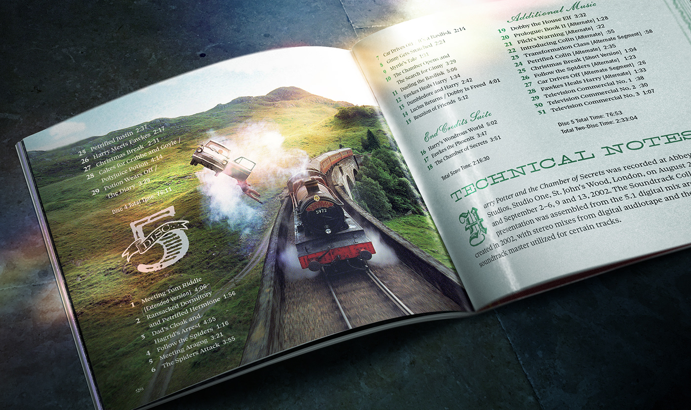
There are quite a lot of tracks on these expanded, remastered soundtracks. If possible, I prefer to run their longer track listings in the interior of the packaging, rather than the back tray. It makes for a more readable track listing and opens up space for larger, more interesting disc number treatments, which were designed (see above) to work on the tray backs and within the booklet.

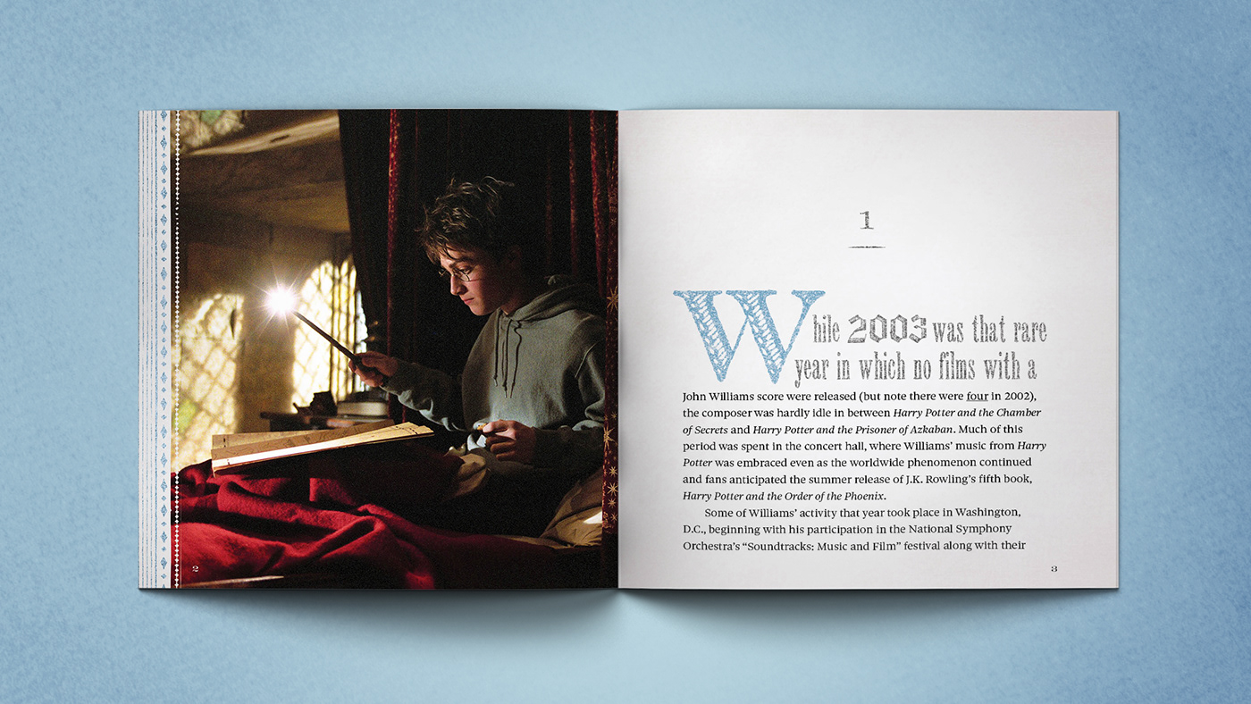
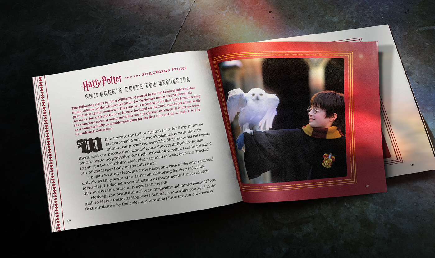
Each film had its own essay, written by album producer Mike Matessino, and the booklets were designed to capture both a chapter-like sense of a literary novel, as well as a spell book or a "History of Magic" textbook.


Originally, each essay had been titled in the style of a handwritten notation (above) but the idea was later dropped.


In addition to the individual essay books for each film, the boxed set would include its own, slightly larger booklet — filled with more photos, lyrics, track listings, various credits, and additional filmmaker notes.


Although commercial illustrator Drew Struzan created posters for each of the first two films, only the first was used in the marketing. Unfortunately, that left his original poster (above left) as something of a loose end in the context of this set's design. It had to be included and the cover of the larger, additional booklet packaged with the set seemed a likely spot. The artwork, however, was very clearly from the first film and I wanted the booklet to capture the series as a whole if at all possible.


For the Hook soundtrack (above), poster details within the green circles were repositioned, while areas in the blue rectangles were removed or covered up by raising the bottom portion of the newly trimmed art.
I had worked with Struzan's art previously, adapting his tall, narrow poster art for Hook (see right above). My solution in this case was to separate Radcliffe's head and his owl Hedwig from the art, then recombine the two, and add a painted backdrop with airbrushed shoulder details that convincingly matched Struzan's style.


Additional booklets like this are much more fun to design and add immeasurably to the visual appeal of the set. By not having to cram publishing credits on back trays or squeeze 60+ “thank you” names into a single page of booklet credits, the reader has the benefit of a very comfortable supplemental book, lushly illustrated and with (surprise!) clear and legible track listings.
Write your congressman, folks. I'd like to design more of these.
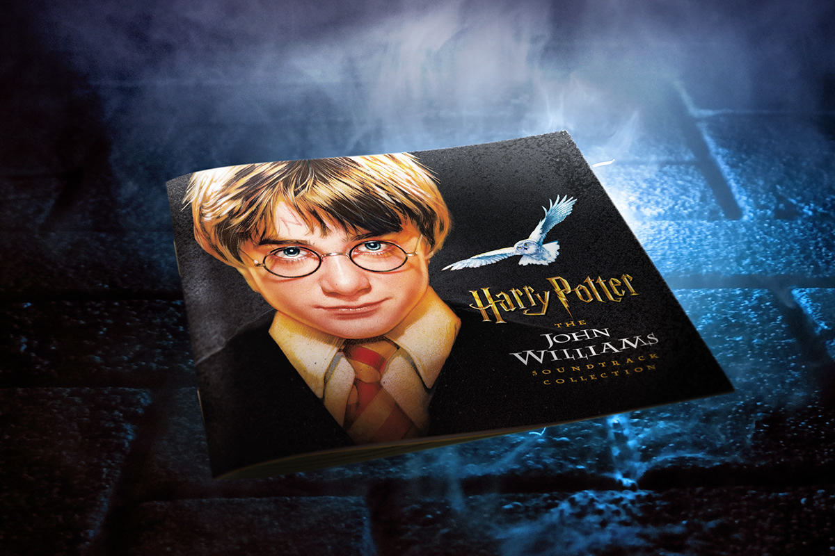
I had planned to keep an overlap of Harry's head with Hedwig the owl (as Struzan had on the original one sheet), but the studio asked that they not touch...


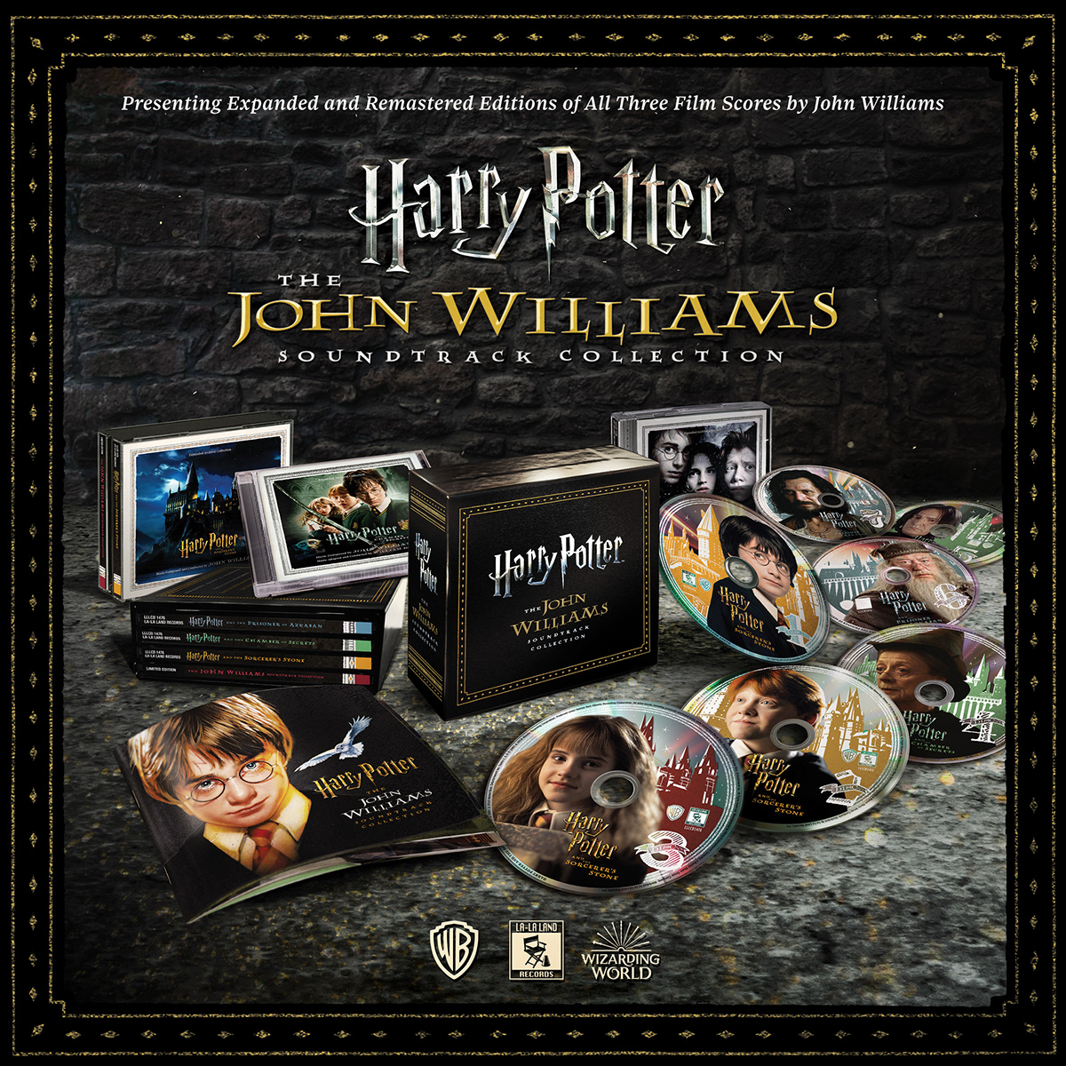
As with previous marquee releases for limited edition collectibles, I began creating a digital product photo (see below) once everything was approved, shooting blank boxes and cases and then stripping in final art and a themed backdrop. Such graphics help to announce and promote a release across social media (mainly Facebook, Instagram and Twitter).